
|
|
|||||||
| Current Events Help understand the world by talking about things happening in it |
|
|
Thread Tools | Display Modes |
 02-11-2010, 11:58 AM
|
#11 |
|
Radical Centrist
Join Date: Jan 2001
Location: Cottage of Prussia
Posts: 31,423
|
The graph means nothing. It is not useful information.
They have chosen to display it as percentage by decade, starting at the first year of the decade, not a useful frame of reference. This has the result of painting the 00s in the worst possible light. Why: because the decade started with a bubble that popped just after the decade began - and ended a year after the popping of another bubble. Let's say you had a graph like this: 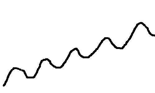 And you decided to measure this section of it: 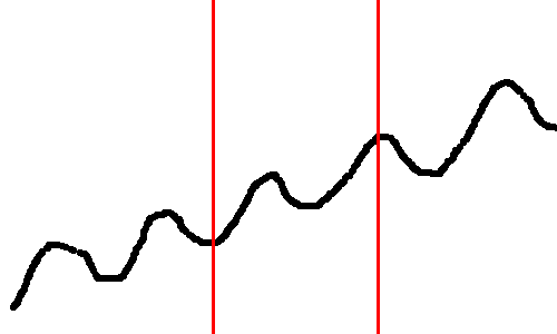 The green line shows your growth. Great success! 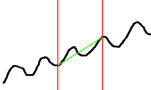 But oh no, you wanted a negative narrative. Not a problem, just use the same distance between the red lines, and measure a different section of the graph: 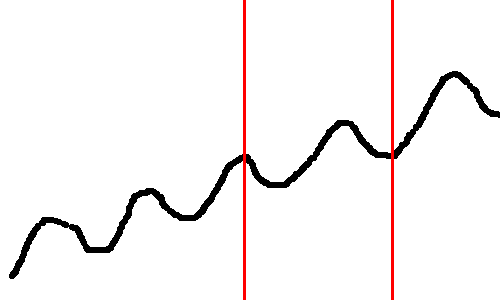 Zero growth! 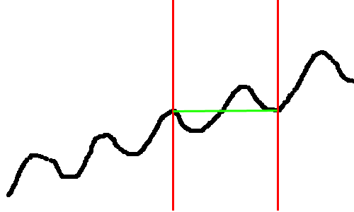 Also, they have chosen to graph number of jobs created - generally not the most interesting measure of employment, and useless to measure the state of the economy. For example, before the 50s-60s boom, unemployment numbers were low, jobs created high, but the poverty rates were often around 30%. The Times graph (I assume it's Times by its style) doesn't come close to giving us an accurate narrative on the state of things. |

|

|
| Currently Active Users Viewing This Thread: 1 (0 members and 1 guests) | |
|
|


 Threaded Mode