Maps, etc.

Diaphone Jim • Aug 31, 2019 7:55 pm
Can't figure out how to get the "Interesting Graphs..." heading.
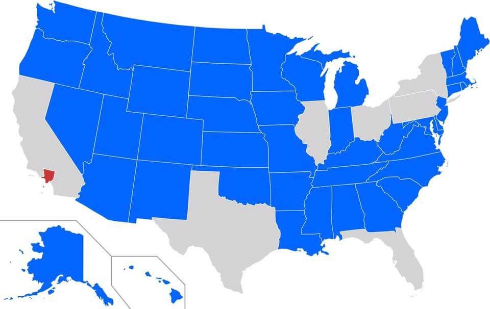
Interesting graphic:

https://pbs.twimg.com/media/DQZ1B05V4AAIwS7.jpg:large
Diaphone Jim • Aug 31, 2019 7:58 pm
Hmmm, doesn't seem to have a title does it?

The blue states have less people than Los Angeles County.
(No, not those blue states.)
sexobon • Aug 31, 2019 8:05 pm
Interesting graphs and charts department is another thread:
https://cellar.org/showthread.php?p=1037711#post1037711
Diaphone Jim • Sep 1, 2019 12:10 pm
I thought of that, but this map didn't really seem much like a "reply" to the foregoing posts.
All is well, though.
xoxoxoBruce • Sep 1, 2019 12:15 pm
"Reply" isn't necessarily replying to previous posts, just the next post in that thread's category.