xoxoxoBruce • Aug 4, 2018 11:14 pm
In the latter part of World War II they spiffied up the packages as a moral booster.
They added color as a claimed moral booster, but with the shit getting heavy at that point made it easier to grab the right meal for the enemy's circadian rhythm.
link
They added color as a claimed moral booster, but with the shit getting heavy at that point made it easier to grab the right meal for the enemy's circadian rhythm.
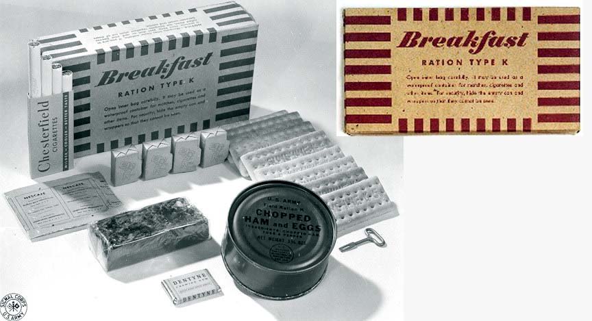
“Rations Type K” were developed by inventor and public health scientist, Ancel Keys, which may (or may not) explain the “K” in K-Ration. (There is debate about that.) The boxes were manufactured by the Cracker Jack company and were similar in size and material to Cracker Jack boxes.
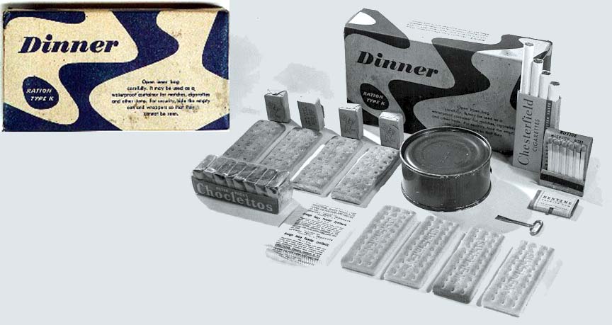
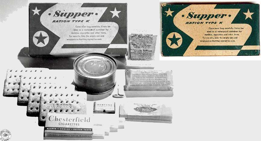
Originally the packages were generically labeled: “Breakfast,” “Dinner” and “Supper.” Towards the end of the war they were redesigned (as part of a “morale” initiative) to make the three meals more easily distinguishable with 3 new color-coded / pattern-coded designs.
Who handled the graphic design? Some anonymous, government-employed graphic designer? An advertising agency of the time? K-Ration boxes were featured in the Brooklyn Museum’s 2001 exhibit, Vital Forms: American Art and Design in the Atomic Age, 1940-1960, as one of many examples illustrating the impact of organic form on graphic design.
link