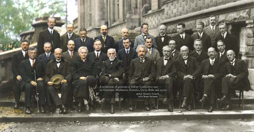
Coloring; Colorizing; Colorization
What ever you call it, adding color to old photographs, whether Black & White, sepia toned, or some other half-toned process, is sure to raise howls of protest from purists. The debate will never end, but I don't see the problem in playing with a copy as long as the original is unharmed. Even photographs of great historical significance.
This picture of Mata Hari, from 1910, prompted such a [strike]discussion[/strike] bitch fest. I like it in full color. The color brings out the detail, makes it more lush, and of course it's boner better.:blush:
Walter Cronkite and one of the bomber crews he covered as a war correspondent. On D-Day he flew in the nose bubble of Shoo Shoo Baby but the clouds were so thick they couldn't find the target and had to turn back. Normally they would have dumped the bomb load blind over enemy territory, or over the channel if there was a danger to the French civilians, but they were under strict orders not to do that because of the 82nd and 101st paratroopers on the ground and wall to wall ships in the channel. So they had to land in the mud in England with a live bomb load.
A lot depends on the skill of the colorist and the lighting of the original B&W. A high-key film noir would probably suffer from the attempt at colorization as would all of Ansel Adams's work, for example.
I first posted the colour version of this image in the
Aircraft thread back in January.
I thought that it might be worthwhile posting it again with the B&W original alongside.
[ATTACH]57188[/ATTACH] [ATTACH]57189[/ATTACH]
A British aircraft belonging to Imperial Airways is refuelled at Semakh, Palestine (now Israel) in October, 1931 during British rule. Transformed from a black and white original, the photo has been brought up to date by a skilled teenager working out of his bedroom. American student Jared Enos (18) from Rhode Island confessed he never had an interest in art, but found a connection with "colourisation" and the reviving of old black and white photographs.
I always wonder, are they randomly guessing on the base colors (like the blue lettering,) or have they done their research to figure out that it really was some shade of blue?
I thought maybe the minute differences in shades of gray may give clues as to what the actual color was.
Maybe it's just the experience of the colorist's eye...
[ATTACH]57198[/ATTACH]
[ATTACH]57199[/ATTACH]
There is some additional photoshoppery going on here. Guess they couldn't figure out what color that stuff should be.
There is some additional photoshoppery going on here. Guess they couldn't figure out what color that stuff should be.
Well spotted, sir!
You might be interested in these photos of the western US taken between 1864 and 1910 and converted by the same chap.
The article doesn't show the B&W image but the coloured versions are eye catching to say the least.
LINK.The whole process is kind of interesting. I think some of the colors are wrong. The distant background is fairly green, but I think it is winter time from the heavy coats. It should be gray in the distance. Also, there is what appears to be a puddle to the right of the guy with his back to us, and it is colored brown. I thing that is ice from something dripping in a puddle and freezing, so it should be more of a whitish gray color. Not brown.
I think the background is fog, but yes, greenish. I also think the "puddle is a patch of snow/ice with sand/dirt blown on it. The difficulty of picking out these details is exactly what's lacking in old B&W pictures, but they did show what they intended for you to see, the main objects.
You might be interested in these photos of the western US taken between 1864 and 1910 and converted by the same chap.
Very cool. Thanks.:)
I can't get to that link, must be some kind of flash or something.
When I was a kid one of my friends mom use to color b&w's at home, all portraits as I remember. She used a q-tip and I thought she did a great job but I was 13 yrs old
[ATTACH]57198[/ATTACH]
[ATTACH]57199[/ATTACH]
There is some additional photoshoppery going on here. .
Exactly my thought -not the bit you pointed out particularly but it's just not "right"
The wings weren't done along with the lettering on them, and the second picture is half an A wider. But like the B&W original it shows what the picture was taken to show you. Maybe you feel the result is too soft, but the original was also soft.
Oh, and I doubt the propellers were that color.
RE: coloring B&W photos
@ GRavdigr, colors reproduce differently in black and white. For example, red and blue are the same tone of gray in a black and white photo. Generally speaking, the more color contrast in the original, the less b&w tonal contrast. Rule of thumb: if it looks AMAZING in color, it will look like shit in b&w.
The other limiting factor is that the underlying tones of the color are tones of gray, making all the colors muddy by default. In a true color photo there might be some muddy colors but colors in shadow don't have gray added to them, they are different colors, or shades of a color, so you end up with colors that are less intense in a colorized photo.
The best candidate for a colorized photo is one that is lighter, and has flatter contrast.
Here is a rare example of Ansel Adams's color photography (good thing he kept his day job) and a similar view of the same subject by a photographer paying homage to AA. The B&W version of AA's photo was only 340 px so I didn't bother with it.
You may now return to your heretical, culturally criminal colorizing.
There is great artistic merit in black and white, no doubt, especially if the photographer chose it during a time when color was available. Those guys know what they were doing.
But what if it's a standard news or candid shot that would have looked amazing in color, but now looks shit in black and white? For me, the thing I like is the historical photos get surprisingly humanized for me with color. I would never have realized it until I saw it differently, but the black and white (apparently) lends it a sense of "not really us." That's often the purposeful effect of an artistic photographer, but it can also lend a sense of "not really relevant" to today, which is decidedly not the point of a documentary news photographer.
..For me, the thing I like is the historical photos get surprisingly humanized for me with color. I would never have realized it until I saw it differently, but the black and white (apparently) lends it a sense of "not really us." That's often the purposeful effect of an artistic photographer, but it can also lend a sense of "not really relevant" to today, which is decidedly not the point of a documentary news photographer.
Most people assume that because 99.99% of the photos they have seen of WW II are B&W, that there was no color film at the time. In fact there was and it was a conscious decision not to use color film when reporting on the war or documenting it for the very reasons you state.
People back home saw the war through an extra layer of abstraction by viewing it in black and white. Allowing them to see color images would have made the ghastly-ness more real and evident.
Another, more practical, reason is that color film was still relatively rare and expensive. It was used by intelligence though as it held more information than b&w.
There is an article about this topic somewhere and a number of youtube videos of combat footage filmed in color.
Color makes WW II refugees more human...

Bigots more threatening...

Scientists we've only read about more real...

The past more current...

History more real...

Interesting that in the car crash one, the black guy and white guy are standing right next to each other as if they are friends. I know the picture is slightly posed, but I would think it would be unusual, especially in that time, for the two to be standing side by side. I wouldn't have noticed it as much in black and white.
I think it's a black guy and a light guy.
But it could be a black guy and his boss.
One more to add to the mix.
[ATTACH]57224[/ATTACH]
Mulberry Street, New York.
I posted this in December 2014 after it appeared in the UK press as part of the book launch for An American Odyssey.
A new book, An American Odyssey by Marc Walter, features hundreds of the first colour photographs of the United States.
The rediscovered Photochrom and Photostint postcard images were produced by the Detroit Photographic Company between 1888 and 1924.
Not colour photographs as such. I understand that they were B&W images which were converted to colour by the
Photocrom process.
It would have been interesting to see the B&W original.
This has been colorized a little. 1939 Chicago cops tried these because of fog.
There's a woman in Maine who does a beautiful job coloring cars among othe things.
That woman in Maine is on facefuck.
imbued with huesAre they historically accurate?
Of course, but what difference does it make looking at old cars?
It's neat to know if the colors were the actual colors of the cars at the cars at the time.


