I always like the maps after an election. Here's an
excellent site that takes us through the breakdown of the vote and how the country really looks.
The most accurate map is this one:
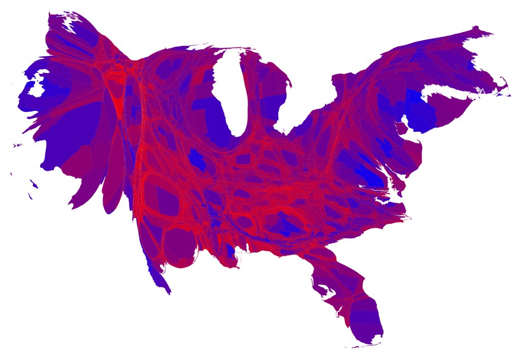
It doesn't look much like the US because it's broken down by county, and each county is sized to reflect the actual population. Then it's colored to reflect the vote of the county. Most counties are purple because they are split. Some are really red, because they are mostly Republican, and some are really blue, because they are mostly Democrat.
Clearly, we should look at this and realize that we are not the divided country as shown in the state electoral college map.