Graphic representation of information usually goes well here.
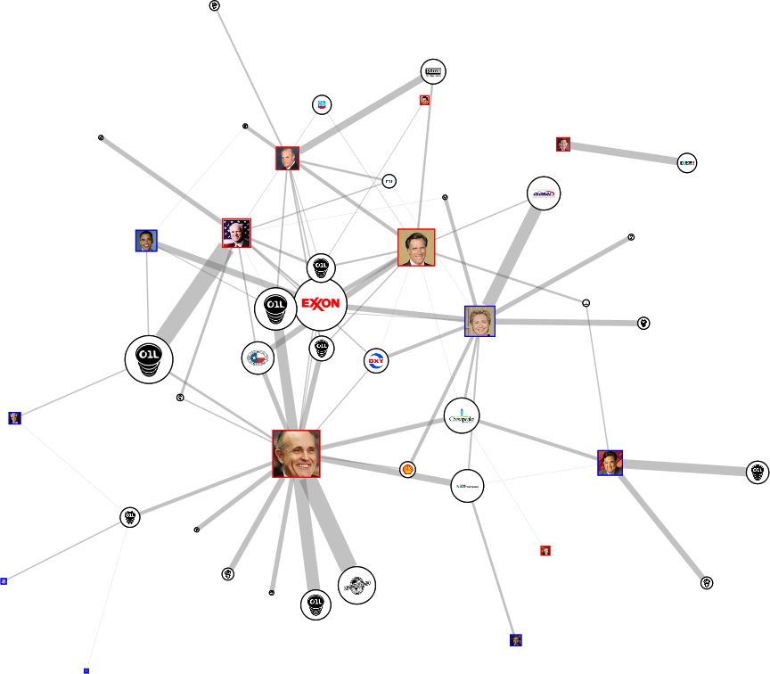
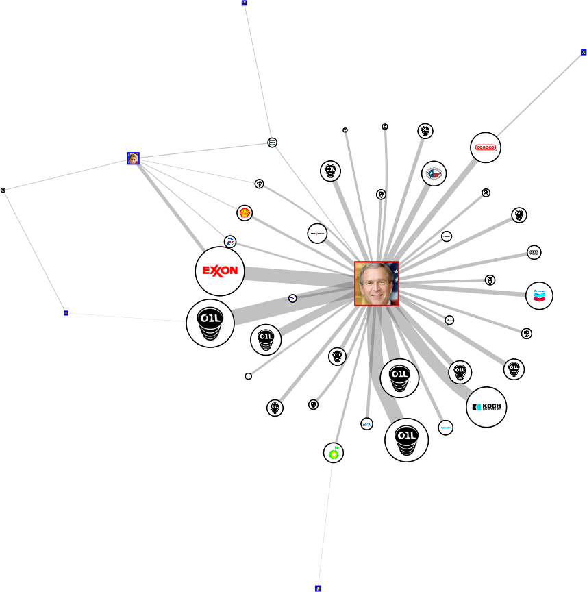
The good people at Oil Change International have tallied up which US politicians are getting money from the oil industry, and laid it out
here.
The site is very interactive: you can see all sorts of details: names of candidates, companies, and if you follow the links, even more.
The size of the company's logo indicates how much they have given. The size of the candidate's picture indicates how much they have received, and the thickness of the lines indicate how much each company has given each candidate.
Unfortunately, the image doesn't transfer well: the original has all sorts of features which show names for each icon. These were lost in the transfer, so check the original site.
Most interesting I think is that Giuliani has (so far) got the most money, and it hasn't done him much good.
You can also check the last two elections. No surprises there!
