
|
|
|
What's IotD? The interesting, amazing, or mind-boggling images of our days. |
|
IotD Stuff |
|
Permalink Latest Image |
|
|
|
Some folks who have noticed IotD
Neatorama |
|
Common image haunts
Astro Pic of the Day |
|
Advertising |
12/30/2004: Green flash at sunset
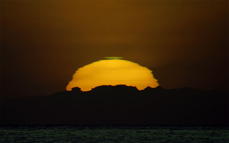
Credit and copyright Tony Cook and used with his permission. This was the Earth Sci pic of the Day a week ago. Taken on Tenerife in the Canary Islands, it's a great photo and also shows an interesting phenomenon - at the top of the sun, a green flash appears. This green is not on the sun itself, but a product of how the atmosphere affects the light. From the ESPoD explanation:
| Green flashes are created by variations in refraction near the horizon. The refractive layer causes sunlight to be weakly dispersed into the constituent colours of red, yellow, green, blue and violet. Violet and blue light are normally scattered in the Earth's atmosphere, with the result that the last portion of the dispersed light to be observed as the Sun sets is green. |
Guess Thursday Dec 30 12:58 PM
very cool 

glatt Thursday Dec 30 12:58 PM
pretty
BigV Thursday Dec 30 01:53 PM
More pics of green flash.
http://www.polarimage.fi/sun2/ataulu2b.jpg
I must say that this fella's website has the most incredible collection of sky / weather / water pictures. It was a BIG time sink for me when I came across it.
Enjoy!
xoxoxoBruce Thursday Dec 30 02:57 PM
On Golden Pond. 
capnhowdy Thursday Dec 30 05:38 PM
I understand the color bit, but I wonder why the edges are so rough. Almost looks like an overexposure. Very beautiful to say the least.
blase Thursday Dec 30 11:38 PM
Didn't we see a similar image a while back, I seem to remember something similar...
linknoid Thursday Dec 30 11:59 PM
I actually liked the last one that was used for IotD a bit better:
http://www.cellar.org/showthread.php?t=2395
This one is still pretty cool.
cweekly Friday Dec 31 02:21 PM
| capnhowdy: I understand the color bit, but I wonder why the edges are so rough. |
another note bene: this is also related to the reason sunsets are so pretty: the red and orange hues are caused by the lengthening of ths sun's rays as the sunlight travels further, it's in effect being stretched, and longer wavelengths are more red, while shorter ones are more blue. (this "redshifting" is an example of the doppler effect, which also explains why car engines sound higher pitched as they race towards you then suddenly lower as they recede)
that's the gist anyway (from memory),someone else may post a more technically precise answer
happy new year
-cweekly
ps I almost never post but I've lurked here for years. hi!
xoxoxoBruce Friday Dec 31 03:20 PM
| someone else may post a more technically precise answer |

linknoid Friday Dec 31 06:04 PM
|
Originally Posted by cweekly
another note bene: this is also related to the reason sunsets are so pretty: the red and orange hues are caused by the lengthening of ths sun's rays as the sunlight travels further, it's in effect being stretched, and longer wavelengths are more red, while shorter ones are more blue. (this "redshifting" is an example of the doppler effect, which also explains why car engines sound higher pitched as they race towards you then suddenly lower as they recede)
that's the gist anyway (from memory),someone else may post a more technically precise answer |
But the real answer to why you get the reds and oranges at sunset is the same reason the sky is blue. Go back and read the quote that Undertoad posted with the original picture again:
| Green flashes are created by variations in refraction near the horizon. The refractive layer causes sunlight to be weakly dispersed into the constituent colours of red, yellow, green, blue and violet. Violet and blue light are normally scattered in the Earth's atmosphere, with the result that the last portion of the dispersed light to be observed as the Sun sets is green. |
(I was going to explain why blue scatters and red doesn't, but I figured the more I write, the less people are going to take the time to read it)
capnhowdy Saturday Jan 1 09:21 AM
Thanks for the lessons, Guys. It does make sense, even to me. It seems like the sunrise & sunset would look almost alike, but sunrises are always loaded with yellows, golds, and oranges while sunsets are filled with reds and purples. A great gift nature has given us. I hope to enjoy thousands more at each end of the day. Imagine trying to explain how a beautiful sunset looks to a blind person who has never seen one. Now that would be a challenge..... 
Happy Monkey Saturday Jan 1 11:11 AM
I wonder if the temperature of the air causes the sunrise/sunset color difference. In the morning, the sunlight is advancing through cold night air, and in the evening it is retreating through warmer daytime air.
xoxoxoBruce Saturday Jan 1 04:50 PM
|
Originally Posted by linknoid
See, when it's scattered, all the blue end of the spectrum gets scattered, and the red end isn't. Near sunset the light has to go through so much atmosphere that most of the blue end of the spectrum has scattered out (which makes the sky look blue), and all that's left is the reds and oranges (and some green, which is what the IotD is about).
|
So how can we get green if the blue component in already dispersed?
And how can the violet get dispersed if half of it is red yet the red doesn't?

linknoid Saturday Jan 1 06:36 PM
|
Originally Posted by xoxoxoBruce
If I remember art classes correctly green is yellow & blue and violet is blue & red.
So how can we get green if the blue component in already dispersed? And how can the violet get dispersed if half of it is red yet the red doesn't? |
Our eyes only see 3 colors: red, green, and blue. Using those 3 colors you can simulate most any color, which is why TVs and monitors only use red, green, and blue (RGB). There are 3 types of cone cells in your eyes, one for each of those colors, so every every color you see is based on the proportions that each of those cells are activated.
When you see yellow, it means that both red and and green receptors in your eyes have been activated. Yellow light activates both red and green receptors (since its wavelength falls in between red and green), but if you mix red and green light, it has the same effect of activating red and green receptors. And when you see either yellow light or red and green lights mixed, you can't tell the difference, your brain just interprets it as yellow.
On the absorbtion side of things, the primary colors are cyan (anti-red), magenta (anti-green), and yellow (anti-blue). That's why color printing uses Cyan, Magenta, Yellow and blacK (CMYK) instead of red, green, and blue to reproduce all the colors. Cyan absorbs Red light (and reflects green and blue), magenta absorbs green, and yellow absorbs blue, so they're the exact opposite of the 3 primary colors of light. If you take a picture on film, the negative will turn reds into cyans, magentas into greens, and blues into yellows.
But when you mix paints, you aren't mixing pure red, pure yellow, and pure blue. It's hard to tell what light frequencies are being absorbed without using a spectroscope, so the exact colors you see when you mix two colors of paint all depends on which frequencies (colors) of light are being reflected and which cells in your eyes are being triggered by each frequency, and how strongly.
It's not a simple subject at all, and I'm not going to attempt to explain any more here. Hopefully everything I've written here is understandable. If you want to know more, there's an excellent (and much more technical) explanation here:
http://hypertextbook.com/physics/waves/color/
xoxoxoBruce Sunday Jan 2 01:15 AM
Ah ha! So that's why when I mixed all the jars of poster paint together, I got brown instead of white......or even black. Also a ration of crap from Mrs Midyet. 
Superb explanation, linknoid. That explains a lot of things that didn't quite jibe with what I'd been taught. Thanks for taking the time to expand on it so we could all understand it.
YOU, yes you, lurking out there. You didn't know that either, did you? You were waiting for me to make a fool of myself so you could find out the straight skinny. That's OK, I do it all for you. Happy New Year. 
btw- Great link...I'm saving that one.
BigV Wednesday Jan 5 06:06 PM
more about color mixing
XOB:
This picture shows an example of the additive color mixing. The most striking example of this I ever saw was in the Hard Rock Casino in Las Vegas. There was a white wall with some cast metal letters mounted on it and the letters all had shadows of different colors. It just about drove me crazy. My poor brain was trying to reconcile the proper shape and angle and area for all the shadows with the obvious problem that they were not "dark". This image recreates the effect as well as any simple 2d picture can.
Here is the link for the science behind the image.
http://www.newtrier.k12.il.us/academ...t/coloshad.htm
EDIT: I found a picture and an explanation I like better.
http://www.exo.net/~pauld/summer_ins...ploration.html
capnhowdy Wednesday Jan 5 07:57 PM
as an artist , I'm compelled to post:
you cannot acheive, (w/ paint & canvas) what I'm reading here. One cannot confuse the spectrum of color with what is created with physical color mixture. The color spectrum is a basic guideline to the physics of color, which is scientifically the explanation to "everything that shallow people will relate to". There are no limits to color and the effects on the mind. Which is to say.... what you may see is not what someone else will see. I've tried some mixtures as suggested in this thread, and if You'll do the same you'll realize that it is totally hypothetic and "textbookish". Color, let alone art, is what is absorbed in one's mind & their imagination. What looks green to me may be teal to you. What is provocative to you may be calming or docile to me. In the minds eye, of course. There is no scietific proof that we even see color at the same level or hue or tone, etc. Especially intensity. Color is a very personal thing. " I saw red" may mean to you that you were really pissed while to someone else may mean they were totally elated.
capnhowdy Wednesday Jan 5 08:03 PM
When you are dealing with color, shitcan the spectrum. It is totally scientific and has absolutely no imagination, preferences, or emotional feelings. ART as well as color is a very personal thingy. That's all I've got to say about that...............
xoxoxoBruce Thursday Jan 6 05:05 AM
Thanks BigV. That gives me some decorating ideas.
xoxoxoBruce Thursday Jan 6 05:42 AM
|
Originally Posted by capnhowdy
When you are dealing with color, shitcan the spectrum. It is totally scientific and has absolutely no imagination, preferences, or emotional feelings. ART as well as color is a very personal thingy. That's all I've got to say about that...............
|

linknoid Thursday Jan 6 10:18 AM
|
Originally Posted by capnhowdy
as an artist , I'm compelled to post:
you cannot acheive, (w/ paint & canvas) what I'm reading here. One cannot confuse the spectrum of color with what is created with physical color mixture. The color spectrum is a basic guideline to the physics of color, which is scientifically the explanation to "everything that shallow people will relate to". There are no limits to color and the effects on the mind. Which is to say.... what you may see is not what someone else will see. I've tried some mixtures as suggested in this thread, and if You'll do the same you'll realize that it is totally hypothetic and "textbookish". Color, let alone art, is what is absorbed in one's mind & their imagination. What looks green to me may be teal to you. What is provocative to you may be calming or docile to me. In the minds eye, of course. There is no scietific proof that we even see color at the same level or hue or tone, etc. Especially intensity. Color is a very personal thing. " I saw red" may mean to you that you were really pissed while to someone else may mean they were totally elated. |
Each person's eyes respond to slightly different wavelengths. In fact, some men only see 2 shades (they're colorblind), and some women actually, because of genetic issues, have 4 types of cones instead of 3, and they actually see a much different colors (and they're genetics mean if they pass on the genes that produce 4 colors for them, their sons will be colorblind).
But once you get past the issue of how each person responds to the various (and infinite) combinations of the colors of the spectrum, then you have to deal with where that combination of wavelengths and intensities are coming from.
First you have the light source. Each different source is different. The sun produces a relatively complete visible spectrum, resulting in very white light, but by the time it's passed through the atmosphere, a lot of the blue end has been scattered out, and even then the spectrum changes based on the time of day, the weather conditions, the pollution in the air, etc. And there are many other different light sources: incandescent lights, LEDs, mercury vapor lamps, halogen lamps, candles, wood fire, arc lamps, flourescent lamps, and the list goes on. None of them really produce a pure, even spectrum, and each one of the wavelengths it puts out interacts differently with different materials.
Then once it's produced by the light source, it has to deal with absorbsion (and re-emission as other colors), reflection, refraction, transmission, scattering, interference, and who knows what else. So when you mix two paints, you have to account for all those other things if you really want to know what color you're going to end up with. The thing the printing industry tries to do is simplify everything enough that they can reproduce most colors based on just a few, for practical reasons. Which is why we use primary colors. But that's definitely not the whole story.
So I hope you'll forgive me for make the vast simplifications to make the mixing of colors understandable and not overwhelming.
capnhowdy Thursday Jan 6 08:18 PM
|
Originally Posted by linknoid
As a physicist (well not really, but I did major in it in college for a while), I would say that you're correct (at least in this comment, the next one where you say to throw out the spectrum completely is going overboard). In my explanation I specifically avoided going into the complexities of perception or even the details of what happens when you mix color. The point was to explain the basics of how colors work to someone who claimed not to know hardly anything about it.
Each person's eyes respond to slightly different wavelengths. In fact, some men only see 2 shades (they're colorblind), and some women actually, because of genetic issues, have 4 types of cones instead of 3, and they actually see a much different colors (and they're genetics mean if they pass on the genes that produce 4 colors for them, their sons will be colorblind). But once you get past the issue of how each person responds to the various (and infinite) combinations of the colors of the spectrum, then you have to deal with where that combination of wavelengths and intensities are coming from. First you have the light source. Each different source is different. The sun produces a relatively complete visible spectrum, resulting in very white light, but by the time it's passed through the atmosphere, a lot of the blue end has been scattered out, and even then the spectrum changes based on the time of day, the weather conditions, the pollution in the air, etc. And there are many other different light sources: incandescent lights, LEDs, mercury vapor lamps, halogen lamps, candles, wood fire, arc lamps, flourescent lamps, and the list goes on. None of them really produce a pure, even spectrum, and each one of the wavelengths it puts out interacts differently with different materials. Then once it's produced by the light source, it has to deal with absorbsion (and re-emission as other colors), reflection, refraction, transmission, scattering, interference, and who knows what else. So when you mix two paints, you have to account for all those other things if you really want to know what color you're going to end up with. The thing the printing industry tries to do is simplify everything enough that they can reproduce most colors based on just a few, for practical reasons. Which is why we use primary colors. But that's definitely not the whole story. So I hope you'll forgive me for make the vast simplifications to make the mixing of colors understandable and not overwhelming. |

cweekly Thursday Jan 6 11:46 PM
thanks for the clarifcation/correction, linknoid
(sorry xobruce, didn't mean to lead you astray)
so I do think I was right about the striations, but yeah was off base wrt the doppler effect's relevance to the colors. didn't quite jibe with me either, glad to get to the root of it.
"crippled but free, I was blind all the time I was learning to see..."
xoxoxoBruce Friday Jan 7 04:54 AM
That's OK, cweekly. That's what we do here, run it up the flagpole and see if it gets shot at.
|
Your reply here?
The Cellar Image of the Day is just a section of a larger web community: a bunch of interesting folks talking about everything. Add your two cents to IotD by joining the Cellar. |